Building a chat-based all-in-one AI Slider Builder

Role
Product Designer , Design Team of 1
Team
Client
Integritag GmbH
Scope
Product Strategy
Rapid Prototyping
Documentation
Handoff
Timeline
Aug 2024 – June 2025
Link
Challenge
The sales needed to create customized demo landing pages to be able to show all the functionalities of the platform to potential clients. The tool that they were using (Plasmic) was too technical, so they relied on a graphic designer to build them manually. I was tasked to help deliver an AI‑assisted Smart Slider to help automate the creation of custom landing pages so the sales team can create them faster.
Outcome
We shipped a client-facing, chat-based AI Slider Builder that generated mobile landing pages from user input. The bot understood context, but visual quality was inconsistent and it didn’t reliably follow instructions, often resulting in off-brand layouts.
Impact
The MVP helped us validate that a chat-only approach isn’t viable for visual editing: small changes took longer than point-and-fix, which saved us from scaling the wrong model. It also clarified the need for built-in brand guardrails (fixed color palettes, themes, and templates) and enabled us to pause early and avoid further investment.
Project Background
Pressure to ship AI features
ScanVoyage is a B2B SaaS platform for end-to-end QR code management—generating codes, managing print, and linking them to interactive digital experiences→ in this case mobile landing pages.
As every SaaS platform in 2024, also ours had the pressure to release AI-driven products. It not only looked good on paper but was definitely a selling point for the sales team, so we had to incorporate them.
In order to help sales we needed to build an AI-assisted slider generator that would take on the business info and context and then based on that will design good-looking sliders (mini landing pages), thus replacing manual work and shorting the time to production of custom sales presentation for the sales team.
Process
Aligning UI, prompts, and model behaviour
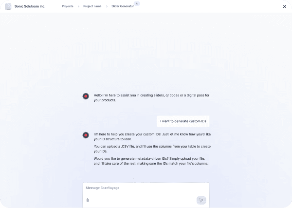
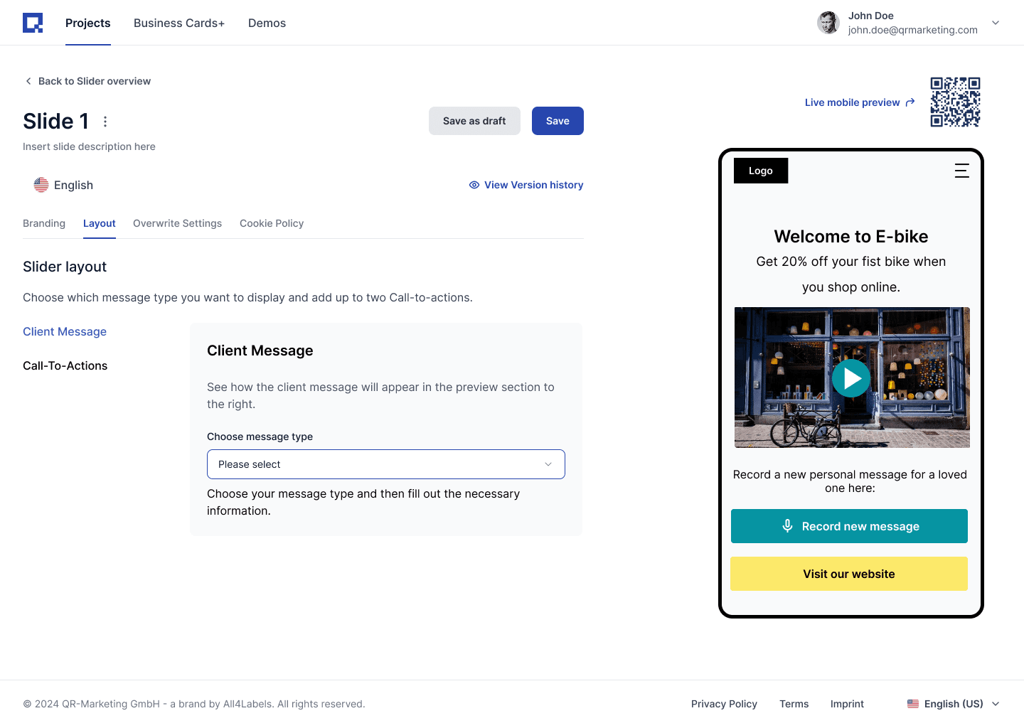
Earlier that year, I redesigned the entire UI and logic for the Smart Slider but we later shifted to an AI-first approach. A step-by-step creation wizard didn't fit the new use case. Slider creation needed to happen on one screen, with AI using the client’s business context to generate layouts and an on-brand color palette.
While I was iterating on ideas for the builder, the developers were tweaking prompts and training the model (initially GPT-4), but they didn’t explicitly communicate what changed.
To close the gap, I requested shared access to prompts and outputs so we could iterate together. That’s when it became clear we needed a shared process with the dev team, in order to ship the AI-powered feature: prompting and model behavior were topics we worked on together.
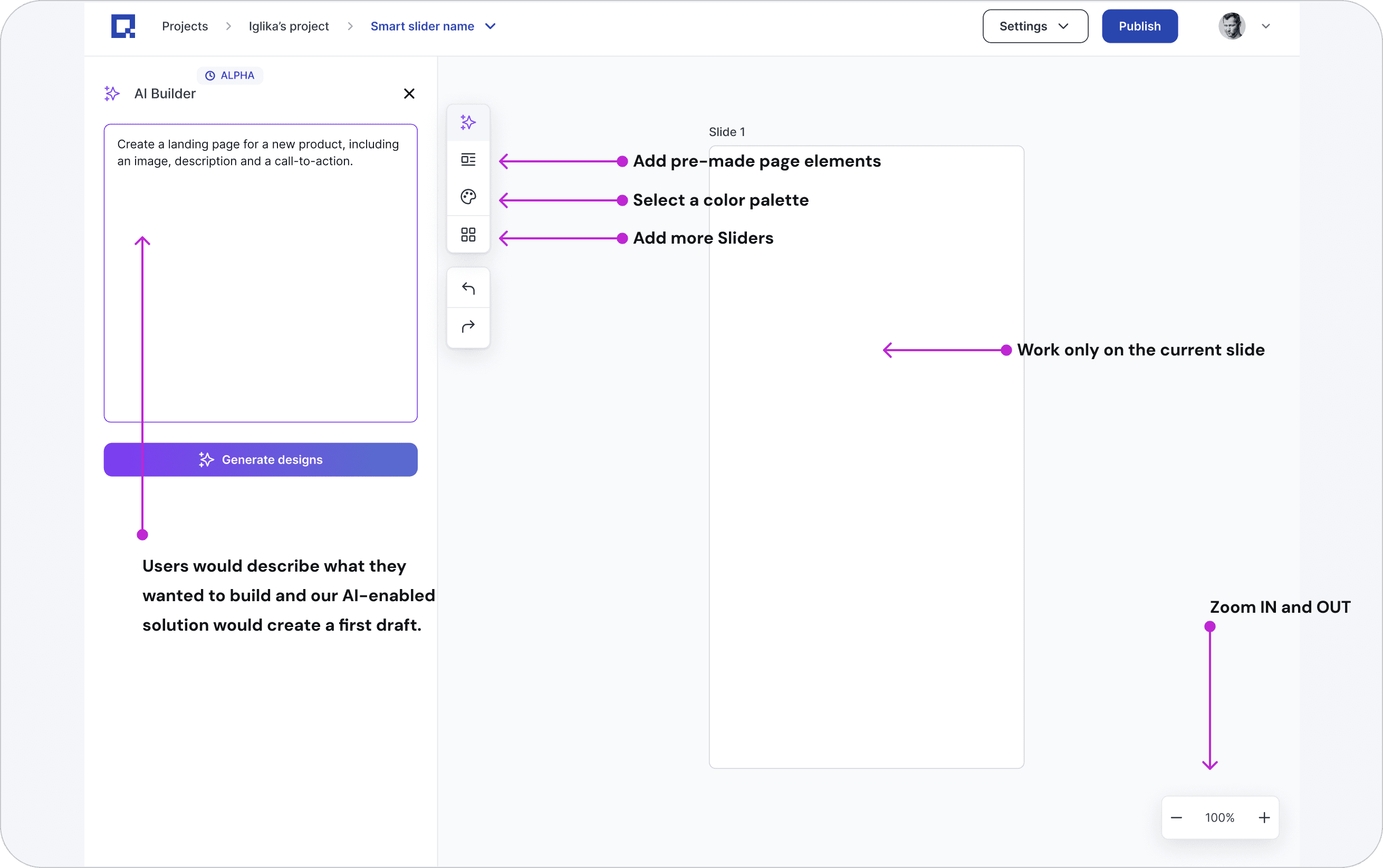
An infinite canvas design tool with chat option to alter different states
The very first concept I created was using an infinite canvas.
We would prompt the user to insert some background information about their business, so AI can save the context and deliver more personalised results.
I thought about what elements were needed to build a landing page: colours, layouts and copy and turned them into separate functionalities:
Colour palettes to apply to the landing page.
Pre-built page elements like a CTA section, Hero section etc. (all saved from our internal templates)
AI capabilities that were very targeted and used only selected items on the canvas as a context
A clean, simple, yet powerful layout to achieve the end goal- create landing pages fast.
Unfortunately, leadership said no, as it was too expensive to build and we didn’t have enough resources.
Narrowing the scope→ from Landing‑Page Builder to Digital Product Passport (DPP) builder (GPT wrapper)
We were thinking how to ‘teach’ design to the model, so the output makes sense to our customers. It was a tricky task and we were failing at it, so, the CTO proposed first to develop a Slider Builder that covers a very specific use case-building a DPP (Digital product passport).
What is a DPP?
A Digital Product Passport (DPP) is a machine‑readable record attached to a product (in our case displayed on a landing page connected to a QR code). It carries verified lifecycle data: product origin, materials, compliance, and reuse/recycling options to enable traceability and meet emerging EU circular‑economy requirements.
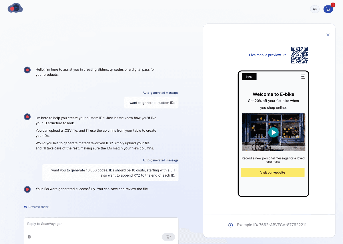
We shipped a DPP Builder in a matter of weeks: a narrow GPT wrapper for Digital Product Passports that generated sliders, product IDs, and links them to existing QR codes (already generated on our platform). Traction was positive, so we reused the base for the Slider Builder.
Consequences: Since this new concept seemed to produce some tangible results, management decided to stick to a chat-only interface. For me, this was not the right direction.
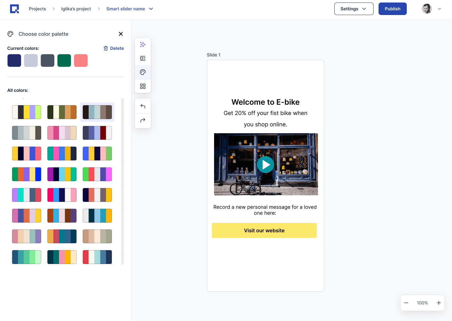
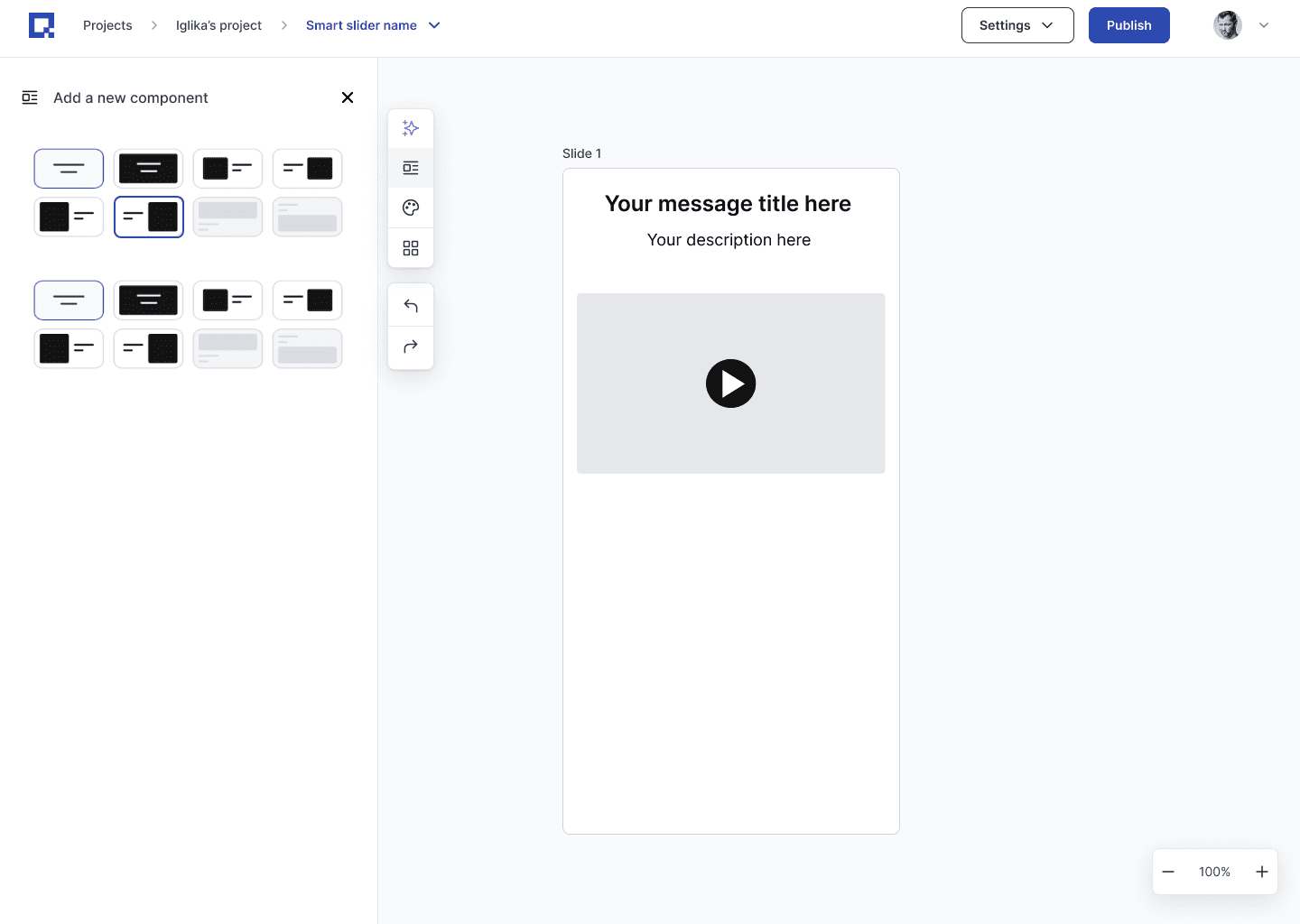
Putting on some Guardrails-with pre-designed layout and color palette rules
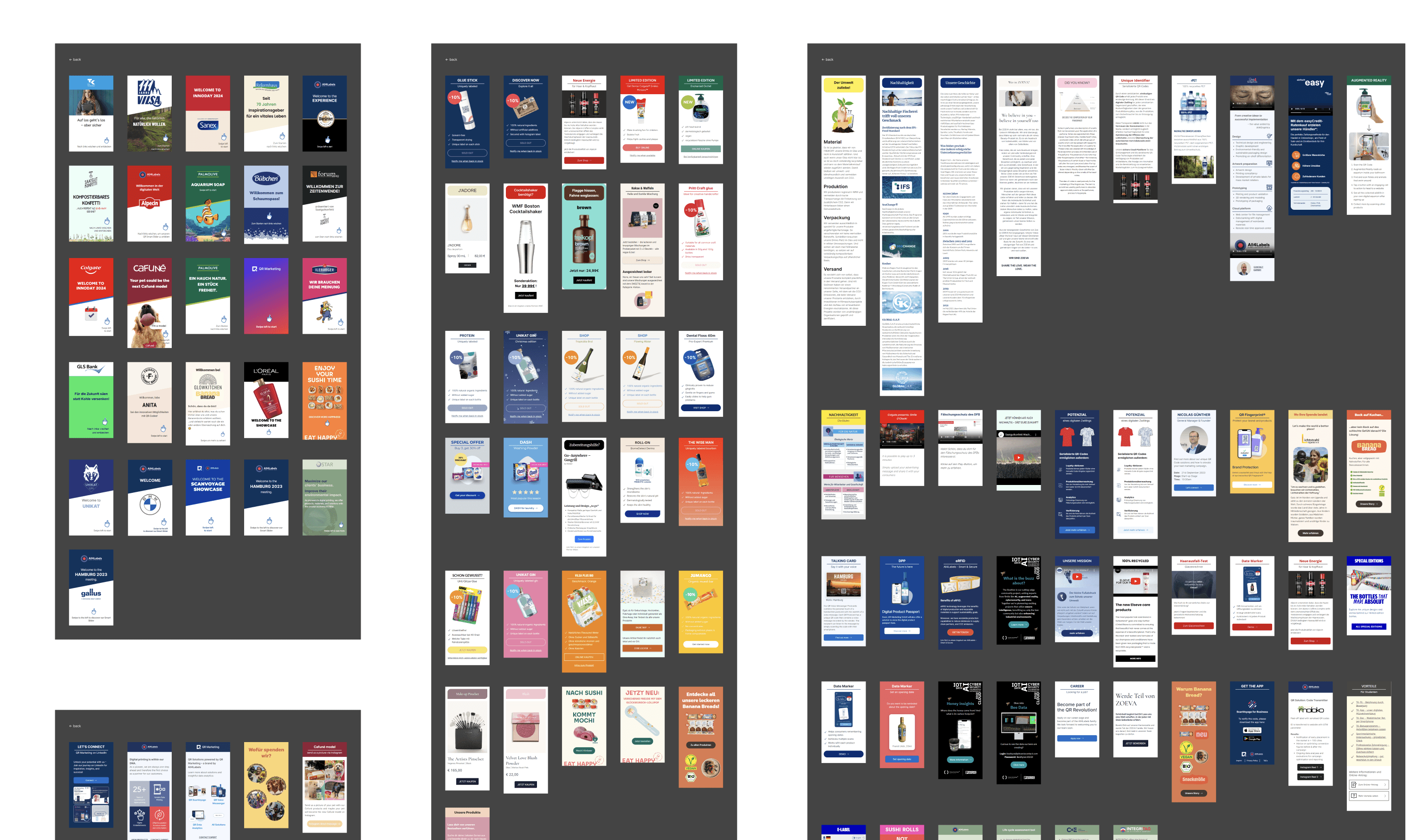
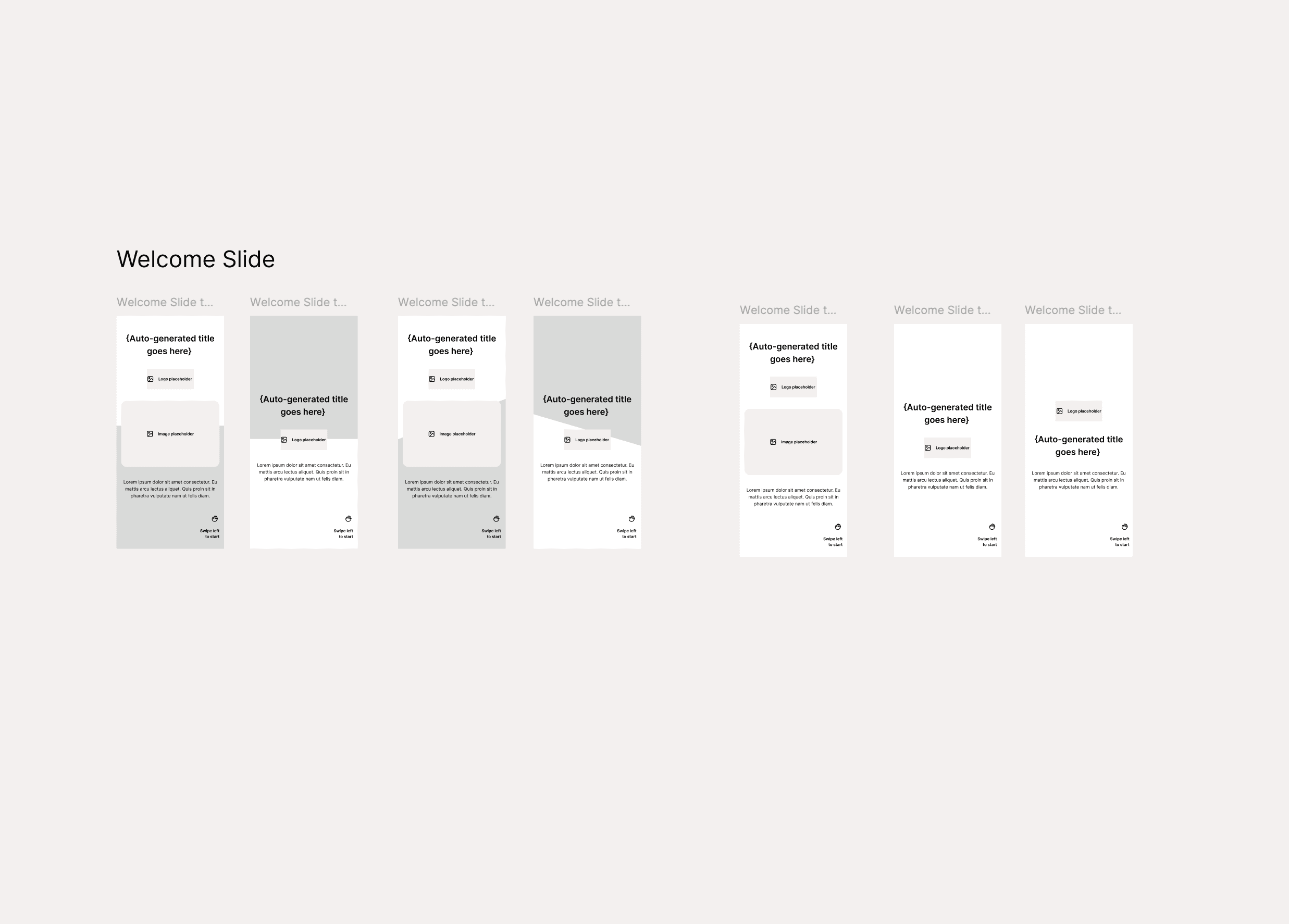
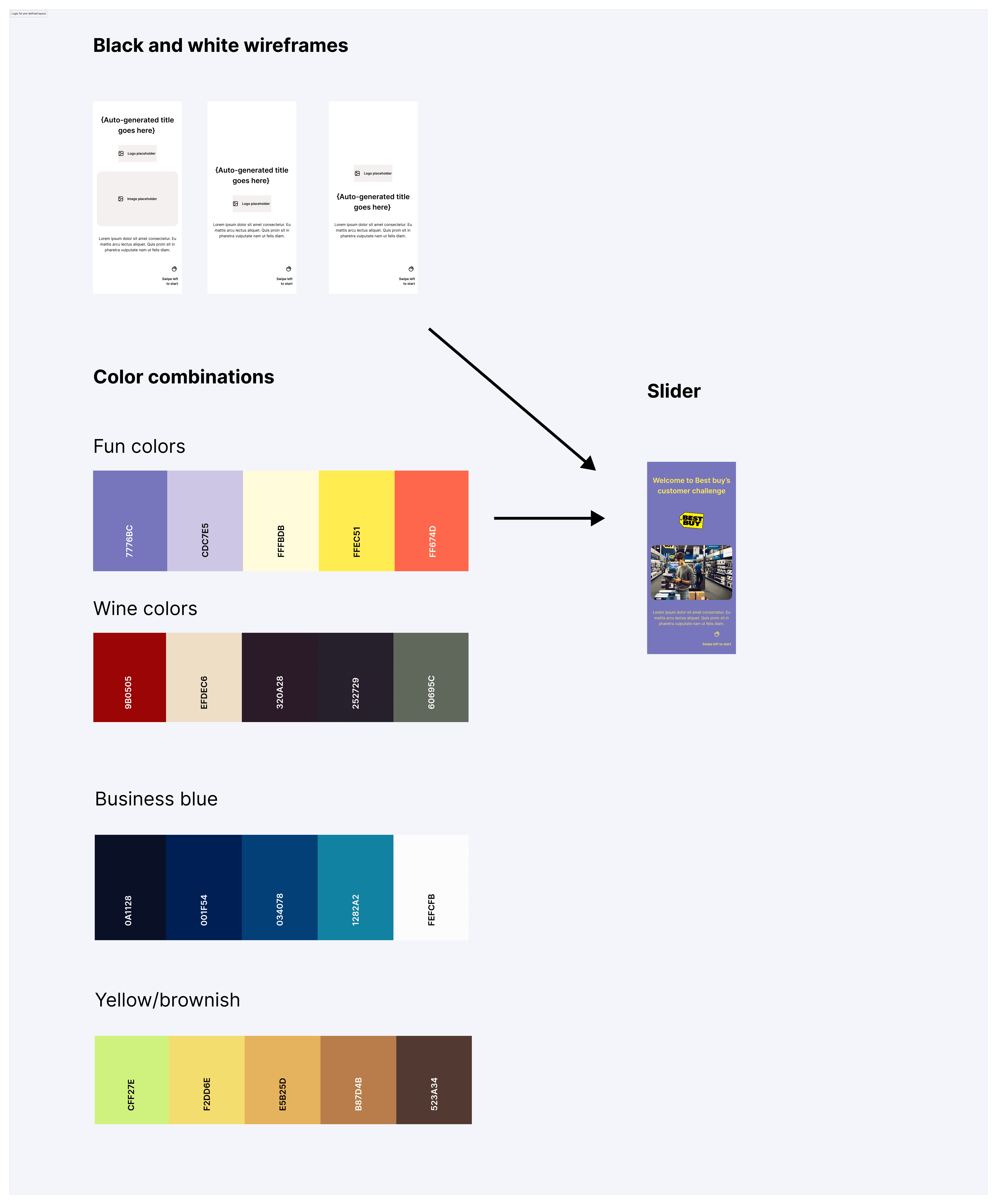
The marketing team already owned a large library of slide templates; I audited and clustered them, then distilled each into black‑and‑white wireframe templates the bot could reuse across use cases (e.g., event, welcome, social, forum, product).
I then defined a simple recipe: pick a wireframe → apply approved color palette/themes → inject only user‑provided text and images. This turned free‑form generation into constrained assembly, improving brand fidelity without increasing user effort. The AI selects from pre‑designed templates rather than inventing layout, keeping output on‑brand and predictable.
Reducing Scope to Protect Usability
Over the following months, the scope gradually expanded as additional feature requests came.
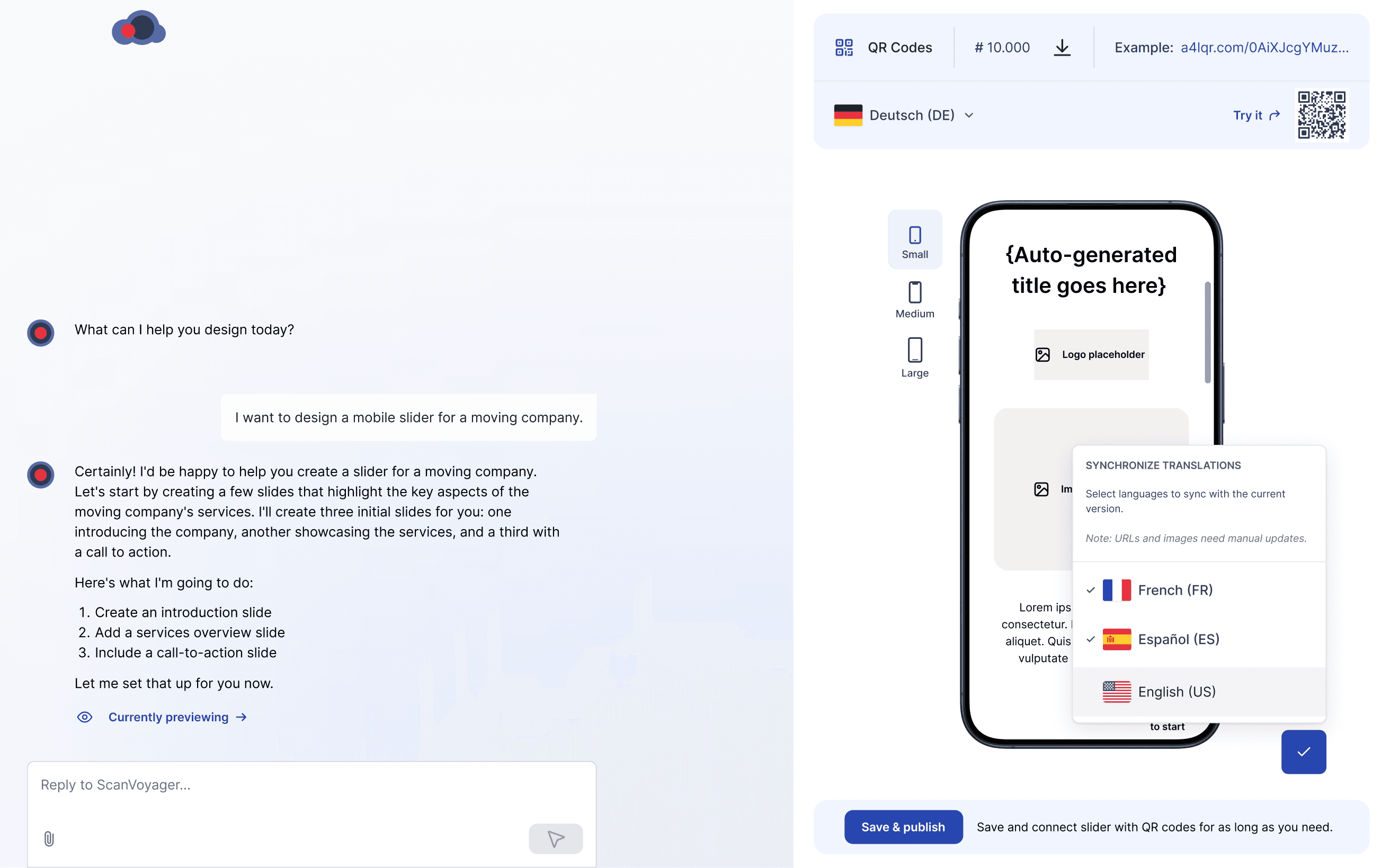
One major addition was localization, which was added as an extra requirement mid-sprint. Supporting more than ten languages significantly increased the complexity of the Slider, requiring careful consideration of multiple edge cases.
To address this, I explored several design approaches and introduced a Floating Language Bar (FLB) concept. However, as the feature set continued to grow, it became clear that the overall complexity was starting to impact usability. I aligned with the CTO on narrowing the scope and focusing the AI experience solely on Slider creation. As a result, we deliberately stripped back non-essential functionality and kept only the core Slider design capabilities within the bot.
Outcome
We shipped an AI-first Slider Builder and defined what it needs to scale
In the end, we shipped a client‑facing, chat‑only AI Slider Builder that designed mobile landing pages based users input.
The MVP worked, but inconsistent visuals and instruction drift made it hard to use in real sales workflows. We used the release to validate the interaction model and put some guardrails for the next iteration.
Why it underperformed (and what we learned):
Chat-only UX slowed down small edits. When users needed quick tweaks (swap an image, adjust copy), they needed point-and-fix controls, the chat option added unnecessary friction.
No prompt templates for first-time users. Without guided starting points (declined by the CTO), users weren’t sure how to begin or what “good input” looked like.
Instruction drift caused off-brand results. The model sometimes misread context (e.g., car parts brief → winery visuals), which highlighted the need for tighter constraints and brand rules.
Project Impact
Shipped the MVP (AI-first Slider Builder)
Shipped a client-facing, chat-only builder that generated mobile landing pages from a short brief, thus reducing reliance on manual slide production.
Validated the right interaction model
Learned that chat-only slows down small, precise edits. The next iteration needs point-and-fix controls (human-in-the-loop) for quick visual tweaks.
Made brand guardrails a hard requirement
Inconsistent outputs proved CI must be enforced via templates, approved palettes, and typography, shifting generation from “inventing layouts” to constrained assembly.
“Iglika contributed many good ideas to the project and demonstrated a keen sense for appealing design and user-friendliness - potential for optimisation was discussed openly and constructively. Her professional approach and friendly personality made the collaboration pleasant and productive - a clear recommendation.”

Bastian Seibt